
A friend asked if I did anything to modify the colors in my bird photos. The short answer is “Yes.” This blog expands on that answer.
Painters make color choices. When we see a painting by Turner or Monet or Wyeth, we understand that the colors might not be those of the original scene. Sometimes painters of nature are criticized for their color choices. In 2005 I saw a painting by Albert Bierstadt (b. 1830, d. 1902) at the Huntington Library. It showed sunrise over a mountain lake; the sky had flame-red clouds. Commentary next to the picture said that the colors were unrealistic. I suspect the writer was a city-dweller with little exposure to colors in nature. Bierstadt often added fantastical elements to his landscape paintings. But in this lake painting, I thought he captured cloud colors that were realistic. In Bishop I often see flame-red clouds. My wife and I step outside in PJs to enjoy these short displays before sunrise.
Early photos were black and white; so photography started with distorted colors. Our world, after all, is not black and white. Some photographers exaggerated the contrast in their black and white photos. Ansel Adams, for example, used film development methods that created iconic, but unrealistic, images of Half Dome and other scenes.
A variety of color processes for photos were introduced around 1900. Kodachrome 35mm camera film appeared in 1936. I used Kodachrome for years; the colors were pleasing and for years they were the standard for landscapes. With film the colors were baked into a picture; most photographers had no control over color after taking the shot. The choice of film, say Kodak’s Kodachrome or Fujifilm’s Velvia, would determine the final colors.
Now cameras use electronic sensors instead of film. The sensors are made up of tiny photo sites or pixels (pixel = picture element). Lots of them. Most of my bird pictures have been taken with a Fujifilm 26.16 megapixel sensor; over 26 million pixels. Each pixel measures the amount of light that hits it when a picture is taken. But pixels cannot record color; they just measure light intensity. To capture color data, there is a filter in front of each pixel; each pixel just records the intensity of Red, Green, or Blue light. Yellow light is a combination of red and green; if a bird’s beak is yellow, some pixels will record the amount of red light from the beak and others will record the amount of green; none will record yellow. Twenty-five percent of the pixels record Red light intensity only, 25% record Blue light, and 50% record Green light. Then the camera does some wizardry. Let’s pick one random pixel; call it “Pixel Sue.” Say Pixel Sue recorded Green light intensity only. What was the actual color of the light that hit Pixel Sue? Pixel Sue has nearby pixels that recorded the intensity of Blue light. Let’s imagine the intensity of light on the nearest Blue pixel was five times the amount of Green light on Pixel Sue. This suggests the actual color for Pixel Sue might be a mix of about 5 Blue units and 1 Green unit; Blue with a touch of Green. Some Red light pixels are also near Pixel Sue; depending on the light strength on nearby Red light pixels, some red color should be added to the guess for true color for Pixel Sue. The camera will estimate that the true color at the location of Pixel Sue is some mixture of Red, Green, and Blue. It will do this for 26 million pixels!
Not all sensors are alike and not all cameras process the pixel data in the same way. Companies such as Sony, Canon, Nikon, Fujifilm, etc., all have engineers who determine the “color science” for assigning colors to pixels. So when you buy a camera, you have already made some choice about colors.
A delightful 9-minute video by Camon Crocker explains how digital cameras determine colors. Crocker looks like a high-school student, his speaking manner is captivating, and the presentation is polished and enlightening (a pun!):
I set my camera to record large RAW files that contain all the intensity and color estimates for each photo. I later import the RAW files into Adobe Lightroom Classic on my computer and process the images. Last, I export a JPEG file (JPEG = Joint Photographic Experts Group) to my computer’s hard drive and upload that JPEG image to my blog. My goal is to show others the colors of the birds I photograph. Even if I make no color-specific adjustments to the photo, a JPEG file requires a color profile to interpret the data in the RAW file. The color profile used by a camera, phone, or computer will influence how colors look on my computer and in the final JPEG file. I’ll say more about color profiles later. Furthermore, different computers and monitors will display colors differently; the JPEG image created on my Apple iMac may look different on another monitor.
Flame-red clouds near Bishop
On a December morning, Roberta and I drove to Round Valley, near Bishop, to photograph the sunrise on Mt Tom. At 7am, while the sun was still behind the White Mountains, the cloudy sky turned a flame-red that reminded me of the Bierstadt painting I discussed earlier; see the photo below. This photo is flawed; the foreground is just a dark blob and in the middle is an unattractive, power pole. But the cloud colors look realistic to me. I created this image by starting with a Fujifilm Velvia color profile and adjusted using Lightroom’s controls for exposure, shadows, highlights, and contrast.

How do I know the cloud colors above are “realistic”? I remember what I saw and tried to reproduce that memory. But memory is flawed and I could be wrong. I could have taken a picture and looked at that to refresh my memory. Oh, wait … I did take a picture. You can see the problem here; we use memory of color to determine color.
The next image shows the same photo with only one change: I used Adobe Lightroom’s “Standard” color profile. The clouds are now all wrong; hardly any red at all. The Adobe Standard profile is supposed to reveal what the camera’s sensor really recorded. In this case, it did a lousy job of showing the cloud colors.
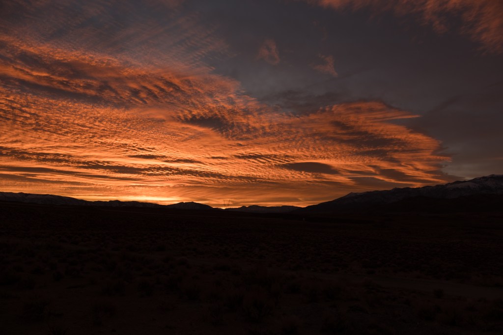
The human eye and brain have MUCH more dynamic range than a camera. The foreground is featureless in the two images above, but my eyes were able to see the red clouds, the sagebrush, a dirt road, a pipeline, power poles, and snow on the Sierra peaks. All these are shown in the image below, because I increased the overall exposure and further boosted the light in the shadowed areas. Now the clouds are washed out and there is an unrealistic red glow on the sagebrush.

My point is that getting close to what your eyes saw may require several adjustments, including changes that influence colors.
My goal on that December morning was to photograph the sunrise on Mt. Tom, which I show below. I think this is how Mt. Tom looked that morning, but I can’t really be sure.

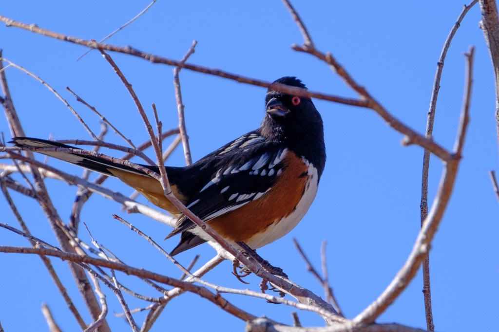
Spotted Towhee and Color Profiles
In February of 2021 I was driving near Bishop and a bird flew into bushes on my side of the car. I stopped, pushed the lens out the window, and pressed the button. The sky was bright blue and the bird looked like a dark blob in the viewfinder. After I got home, I found I had my first photos of a Spotted Towhee. The image below shows the Towhee with no adjustments. The only color choice I made was to use Fujifilm’s Velvia profile. The bird is too dark because the bright sky caused the camera to underexpose the overall picture. It is hard to see feather details or colors.
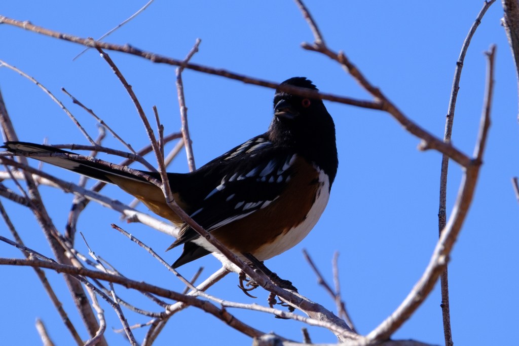
The next photo, below, is the same picture, but this time I used Lightroom to make the bird brighter. Now the Towhee has a dramatic red eye, black head, white streaks brushed onto black feathers, a white underbelly, and bright rust on its side. Are these colors correct? I think they are similar to the colors in several guidebooks. But how do I know those books are precisely correct? I can’t compare my photo with a memory of an actual Towhee; I’ve never been less than 50 feet from a Towhee. All my knowledge of Towhee colors comes from my photographs. To really see a Towhee, I would need to kill one and stuff it.
Both photos above were taken using the Fujifilm Velvia color profile. Velvia was a film that Fujifilm introduced in 1990. If you look up “Velvia” in Wikipedia you will find these remarks:
“[Velvia] has brighter and generally more accurate color reproduction (though many see its high color saturation as unrealistic)… Kodachrome 25 fell out of popularity a few years after Velvia was introduced (in part because of Kodak’s lack of interest in promoting their film)… Kodachrome 25 had previously been considered the film to which all other films had been compared…
“Velvia has very saturated colors under daylight, high contrast, and exceptional sharpness. These characteristics make it the slide film of choice for many nature photographers.”
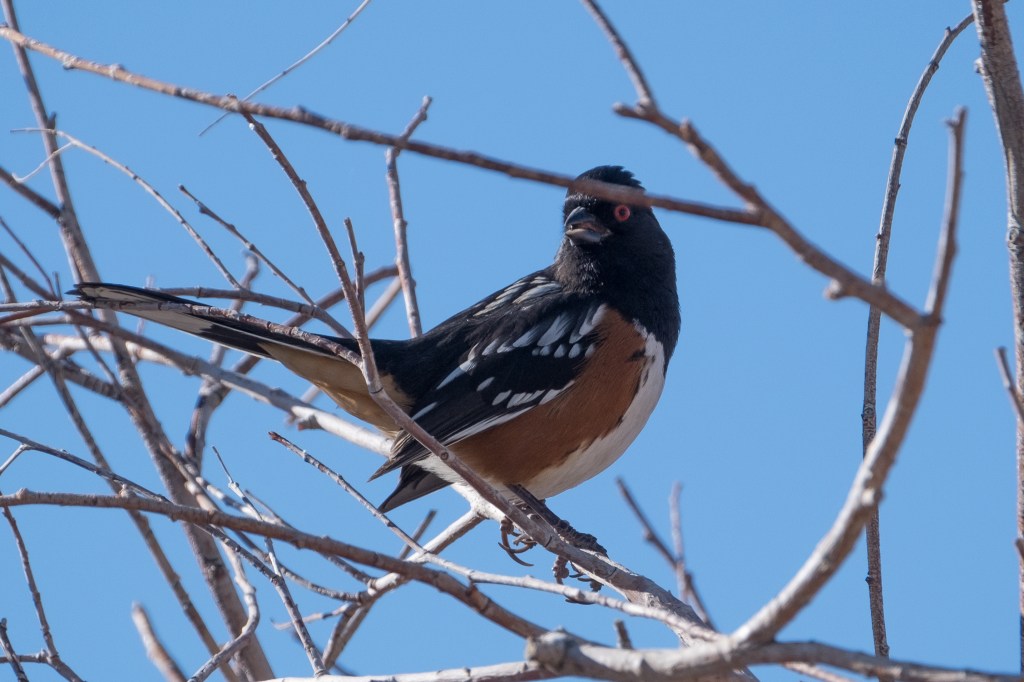
I switched from Kodachrome to Velvia in the early 1990s. In my Fuji cameras, I can use a variety of electronic color profiles that try to simulate color films that Fujifilm used to make; Provia, Velvia, Astia, Classic Chrome, Pro Neg Hi, Eterna Bleach Bypass, and others. Velvia is also called Vivid and Fujifilm describes it as “Vibrant Reproduction, ideal for landscape and nature.” Some nature photographers argue that softer colors and less contrast are now preferred over colors that “pop.” In addition to these Fujifilm film simulations, Lightroom software lets me apply Adobe color profiles to RAW photos; Standard, Color, Landscape, Portrait, Vivid, and many others. Below is the same Towhee picture with the same shadow correction, but using the Adobe Standard color profile. The sky is now more washed out, the rust color is less red, more brown.
Books and websites provide advice about color profiles in Lightroom. You have to choose some profile to see a RAW image. Scott Kelby, an author of many books about digital photo processing and Lightroom, had these comments in 2018: Lightroom “used to process that RAW image using a profile Adobe Lightroom engineers created 11+ years ago, which they felt provided the most accurate interpretation of what your camera captured. This profile…was called ‘Adobe Standard.’ I used to joke it should be named ‘Adobe Dull’ because the result was so flat looking, but it was very accurate as to what the camera captured.” [The “very accurate” claim seems hard to reconcile with the poor job Adobe Standard did for the cloud colors I showed earlier.]
In 2018, Adobe introduced a profile called “Adobe Color” which is now the default interpretation for RAW files in Lightroom. Kelby thinks this profile, which adds “warmth, contrast, and vibrance” is a better starting place for processing RAW files. But with my Fuji cameras, I start with the Velvia profile.
Whatever initial profile you pick, Lightroom offers many other commands for color: exposure, tint, white balance, dehaze, vibrance, saturation, and more. I often use the exposure controls and sometimes add vibrance or dehaze. Lightroom even allows the user to change specific colors, such as red or yellow; I don’t use these color-specific controls. (Many other software packages are available for photo processing, and these also have commands for color: Capture One, Luminar, Topaz, and others.)
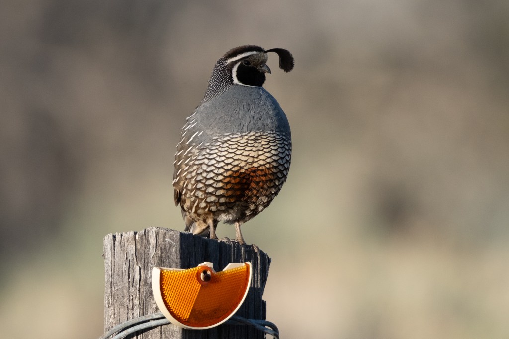
California Quail
To show how choice of color profile influences a photo, I will show a California Quail with three different profiles. As you move from one image to the next, pick a single feature and see how its color is affected. For example, pick the orange light reflector that is nailed to the post. Or the orange on the bird’s belly. Or study the background.
First, let me use Adobe Standard:

The next image uses Adobe Color, the current default in Lightroom:
And the last image uses Fujifilm’s Velvia:
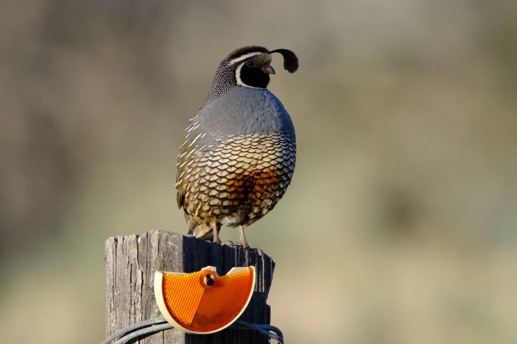
There were trees with green leaves behind the bird, but the blurred background has almost no green in the Adobe Standard image. There is a hint of green in the Adobe Color image and obvious green in the Velvia profile. The mountain photographer, Galen Rowell, wrote years ago that Velvia film showed green colors with more punch compared with Kodachrome.
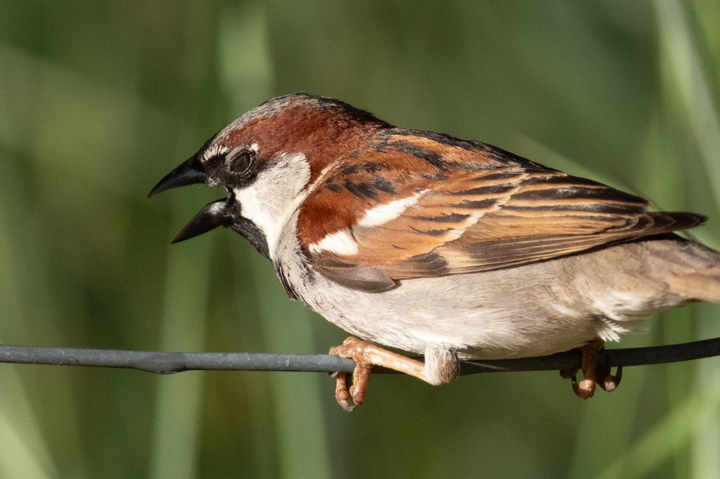
House Sparrow
Let me show 3 images of a House Sparrow, again using the same three color profiles. First, Adobe Standard.

Then Adobe Color.
Last, Fujifilm Velvia.
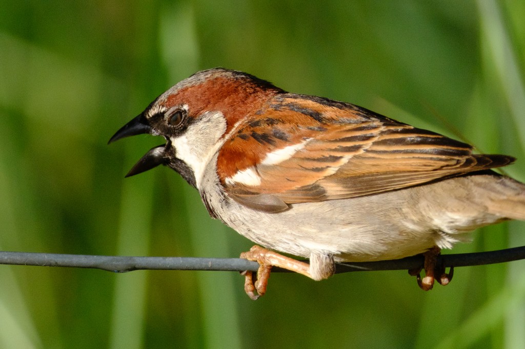
The changes in the rufous feathers are the most obvious. But look at the background vegetation, which was green. Or study the black beak, or the eye, or the talons. Which profile would you use?
Bald Eagle
Let me apply the same three color profiles to a mature Bald Eagle. This bird just ate a Snow Goose at the Buckley Ponds. There is fresh goose-blood on the beak and talons. As you look at the images, look at the color of the blood, the beak, the tree, and the sky.
Adobe Standard profile.
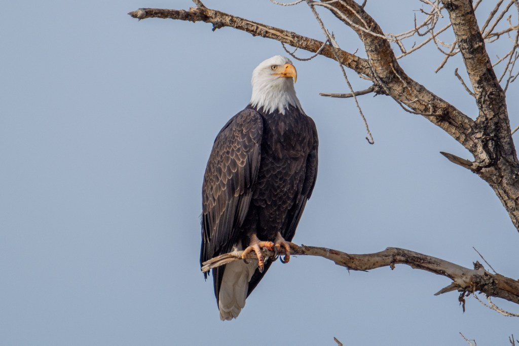
Adobe Color.

Fujifilm Velvia.

I selected the Bald Eagle images above because I think the differences between the 3 color profiles are more subtle than they were, say, for the House Sparrow. You have to really study the images to pick out the differences.
Below is an immature Bald Eagle near Big Pine. She seems offended by my presence. The blurry shape above and to the side of the bird’s head is a foreground branch that is out of focus. Examine how the beak, mouth, eyes, feathers, tree, and sky change from one profile to the next:
Adobe Standard.

Adobe Color
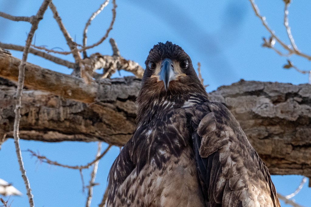
Fujifilm Velvia
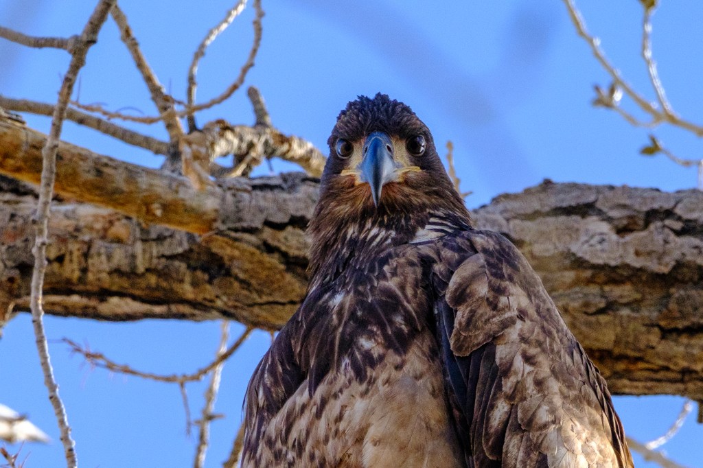
Enough about color profiles. My view is that the Adobe Standard profile is awful, but the other two are acceptable. Your mileage may vary.
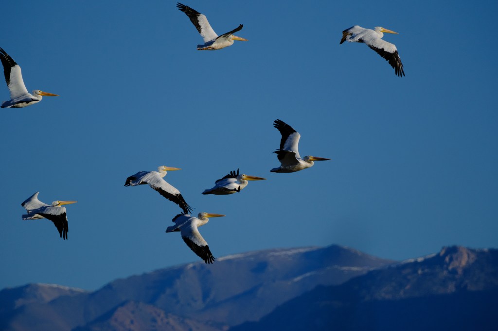
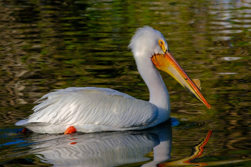
American White Pelican
Usually my goal is to show how a bird looks in nature. But sometimes I prefer a picture for other reasons, even if it does not show what my eyes saw. I’m now printing greeting cards with bird photos and I have printed one card showing an American White Pelican. The card shows the bird exceptionally well, but the background fails to show what I actually saw. I’ll explain below.
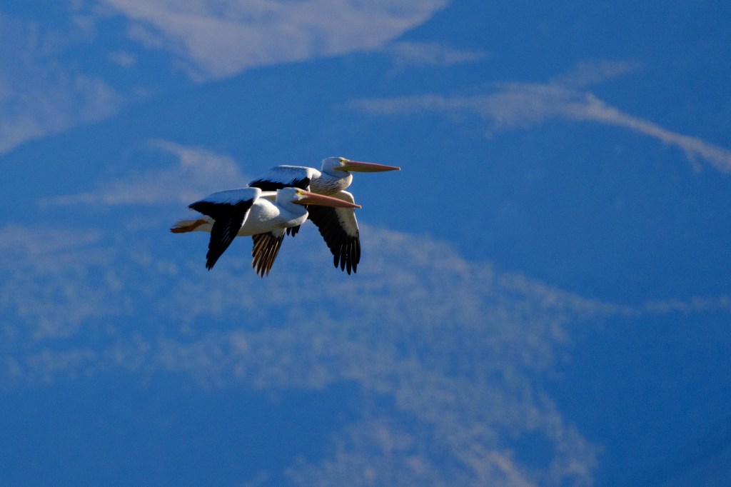
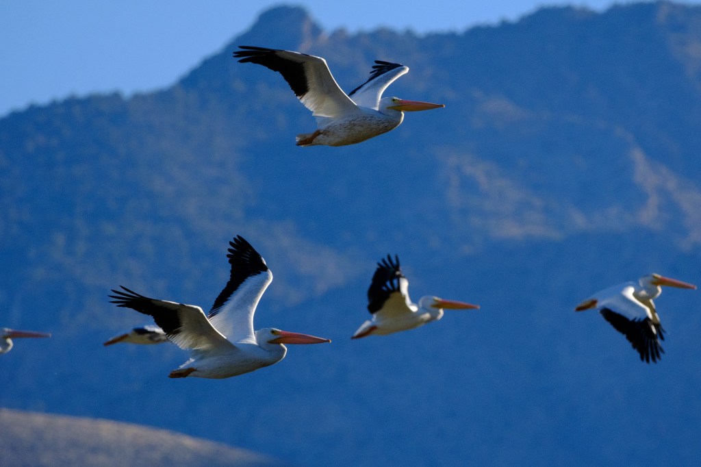
White Pelicans are mostly an inland bird of the American west. They cruise ponderously over the Owens valley in long lines, the feathered version of an Air Force C5-Galaxy. The first 3 photos below show a flock passing in front of the White Mountains.
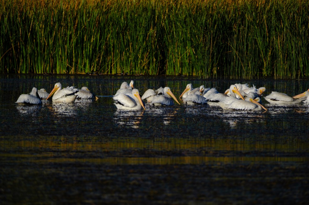
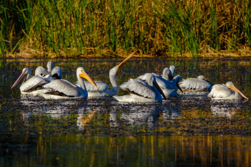
The next two pictures show Pelicans relaxing and fishing on the Buckley Ponds. Juvenile birds have a pink tinge to their beak; see left side of second image.
At Bishop City Park I saw a lone pelican boating about. In the first photo, notice the lumpy growth on the top of the beak. This bump appears during breeding season. I trimmed the image so that you can see the bird’s reflection in the water. This photo is unusual, because aside from picking Velvia as the color profile, I made no other adjustments to this picture. Because I was close to the bird, the camera correctly determined the exposure from the bird’s white body. The result was a sharp photo with lots of feather detail. You can see lines of light reflected by water onto the feathers. Because the exposure was set for the white bird, the background was underexposed.

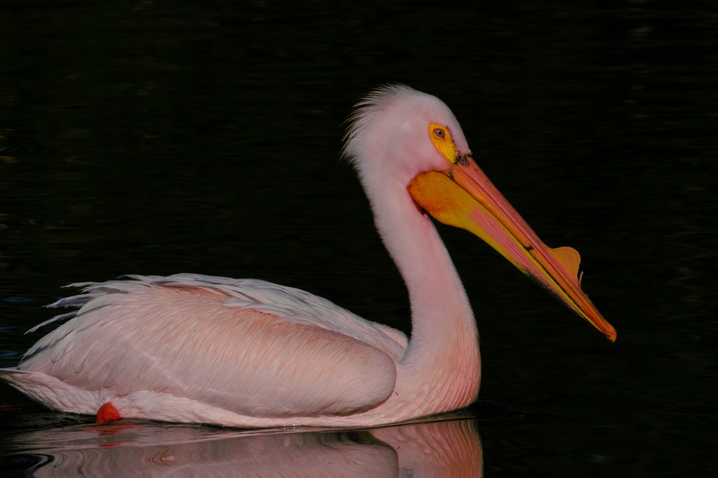
Next I cropped the image to remove most of the reflection in the foreground. The result is an ethereal bird, floating in space. I used this image on the greeting card.

The photo below is the same bird, but exposure was increased, the background was lightened, highlights suppressed. This picture is closer to what my eye saw; this was a sunny day and the water surrounding the bird was nicely lit. A nice picture, but a different mood because the background is now visible. I prefer the previous images with a dark background. Call my choice artistic license.
In the last photo, below, I created the Flamingo-Pelican, a ghastly cross between a White Pelican and an American Flamingo. I used the color mixer controls in Lightroom and added red to the picture, to show how color adjustment is possible in software.
Color printing
Printing a photo on paper involves color issues. In the past I have sent electronic images to print labs. The results have been mixed. I have some excellent prints from Bishop Art Supply. But other prints are too dark or dull. So I decided to learn about printing. This year I bought my first inkjet printer, an Epson SureColor P900, and I started to learn more about color.
In order to get a print to look like the image on your computer screen, you should calibrate your monitor. I bought a device from Datacolor, a company with headquarters in Switzerland. This gadget adjusts the colors on my computer to fit a standard profile. This way the computer and printer are using the same colors. My iMac monitor automatically adjusts brightness according how much light is in the room. I turned this auto adjustment off so that the monitor remains at the same brightness level for printing. I purchased printer papers and learned to send a color profile to the printer for each paper type, such as Red River Polar 60lb Matte and Hahnemuehle Photo Rag Satin. Who knew colors were so complicated? Fortunately, this technology has been mature for a while and it works.
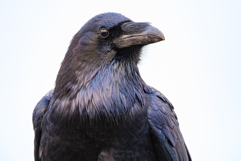
A Common Raven is hard to photograph. Bishop ravens are willing to let me get close, but they fly off when I point a big telephoto lens at them. I suspect they have met people who shoot at them. Furthermore, it is hard to get the right lighting to show the details in their black features. Near Fort Bragg, CA, people feed the ravens. The birds are pretty tame. Below is a Common Raven on the Noyo Headlands Trail. She posed for me against a sky of fog and cloud; the photo looks like a studio portrait. You can see texture and color variations in the feathers. I’m currently testing different papers to make a print that I like for this picture. Making prints has caused me to think differently about some pictures.
A final comment:
Roberta, who helps spot birds that I miss, sometimes can’t resist mocking my photo efforts. She likes my pictures. But when the image of a bird shows up on my computer monitor, she often says “I see you Photoshopped that bird to make it look nice.” I used to defend myself, but now I just role my eyes and smile. I can’t win.
